
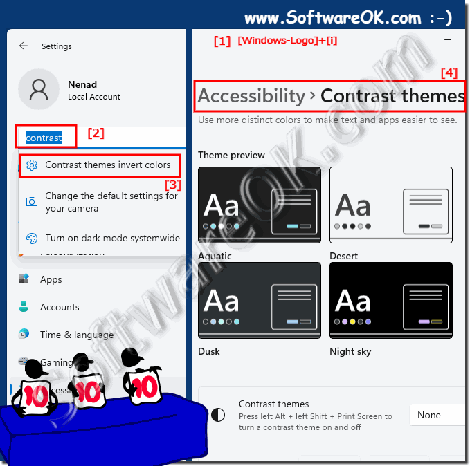
It is quite easy to find and use the contrast designs in Windows 11, which can be an advantage in poor light, for the visually impaired or if you have poor eyesight!1.) ... Windows 11 will find and activate the contrast designs!
|
| (Image-1) contrast themes designs on MS Windows 11! |
 |
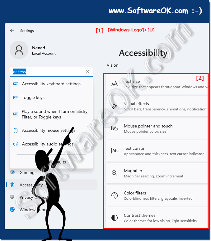
2.) Use accessibility under Windows 11!
Use the keyboard shortcut Windows + U to start accessibility under Windows 11 !
(... see Image-2 Point 1 and 2)
| (Image-2) Accessibility under Windows 11! |
 |
3.)
3.) What and why exactly are contrast themes and contrast designs!
......
About:
Contrast themes typically refer to visual themes or designs that emphasize contrast between different elements such as text and background colors, making content more readable and visually appealing. The use of contrast in design is crucial for readability and accessibility, especially in digital media and user interfaces. Here are some important ones
Contrast themes typically refer to visual themes or designs that emphasize contrast between different elements such as text and background colors, making content more readable and visually appealing. The use of contrast in design is crucial for readability and accessibility, especially in digital media and user interfaces. Here are some important ones
Aspects Related to Contrast Themes:
High Contrast vs. Low Contrast: High contrast themes are characterized by sharp distinctions between foreground and background elements, making text and images stand out. Low contrast themes, on the other hand, have minimal differences, which can result in a more subtle or muted appearance.
Accessibility: Designers often consider contrast when creating user interfaces, websites, and documents to ensure they are accessible to a wide range of users, including those with visual impairments. High-contrast themes can make content easier to read for people with visual impairments.
Readability: Contrasting themes can significantly impact the readability of text. High-contrast text is easier to read, especially in different lighting conditions or on different devices.
Aesthetic Appeal: Contrast is also used to create visually striking and aesthetically pleasing designs. By carefully selecting contrasting colors, designers can draw attention to specific elements and create a sense of balance and harmony in a design.
Color contrast: In web design and digital media, color contrast ratios are often used to measure the difference in brightness between text and the background. These ratios are important for compliance with accessibility standards such as the Web Content Accessibility Guidelines (WCAG).
Themes in Operating Systems and Software: Operating systems and software applications often provide users with the ability to choose between different themes or color schemes, including high-contrast themes. These themes can be customized to individual preferences and needs.
Brand Identity: Contrast is an essential consideration in brand design because it can help logos and brand materials stand out and be easily recognizable.
Info:
In summary, contrast themes refer to design decisions that emphasize visual contrast between elements to improve readability, accessibility, and aesthetics. Designers use contrast strategically to achieve different goals in different contexts, be it for user interfaces, web design, branding, or other forms of visual communication.
In summary, contrast themes refer to design decisions that emphasize visual contrast between elements to improve readability, accessibility, and aesthetics. Designers use contrast strategically to achieve different goals in different contexts, be it for user interfaces, web design, branding, or other forms of visual communication.
4.) Important questions and quick answers on the topic!
1. How do I find the contrast themes in Windows 11?
- Open the Windows 11 settings as usual (Windows + i).
2. Which keyboard shortcut starts accessibility in Windows 11?
- With the keyboard shortcut Windows + U you can directly access the accessibility options in Windows 11.
3. Why are contrast themes particularly important for the visually impaired?
- Contrast themes highlight visual elements and thus improve readability for people with visual impairments.
4. How can I activate contrast themes in the Windows 11 settings?
- Enter "contrast" in the search field of the Windows 11 settings and select the "contrast themes" option.
5. What are contrast themes and why are they relevant for accessibility?
- Contrast themes emphasize the difference between different visual elements, which improves readability and thus increases accessibility.
6. What role do contrasts play in the design of digital media?
- Contrasts in the design of digital media improve the readability of texts and make content more visually appealing.
7. What are the benefits of contrast themes for people with visual impairments?
- Contrast themes improve the readability of text, making it easier for people with visual impairments to use digital media.
8. What is the function of the Ease of Access Center in Windows 11?
- The Ease of Access Center offers various options for customizing the Windows 11 user interface, including contrast themes for improved accessibility.
9. How can I access the accessibility options in Windows 11?
- The accessibility options can be accessed by pressing the Windows + U keyboard shortcut in Windows 11.
10. What keyboard shortcut opens the Windows 11 settings?
- The Windows 11 settings can be opened by pressing the Windows + i keyboard shortcut.
11. How can contrast themes improve the readability of text?
- Contrast themes emphasize the difference between text and background colors, which improves readability for users.
12. What steps are required to activate the appropriate contrast theme?
- Open Windows 11 Settings, search for "Contrast", select the "Contrast Themes" option and enable the theme you want.
13. Why is it important to integrate accessibility into operating systems like Windows 11?
- The integration of accessibility options enables the operating system to be used by people with different abilities and improves accessibility for all users.
14. How can contrast themes improve visual perception?
- Contrast themes emphasize the difference between different visual elements, improving the perception and readability of content.
15. What elements are highlighted by contrast themes?
- Contrast themes highlight visual elements such as text and graphics by emphasizing the difference between them.
16. In which situations can contrast themes be useful?
- Contrast themes can be particularly useful in low-light situations, for the visually impaired or those with visual impairments to improve the readability of on-screen content.
17. What search terms should I use in Windows 11 Settings to find contrast themes?
- In Windows 11 Settings, you should search for the term "contrast" to find the contrast themes options.
18. How can I improve the accessibility of Windows 11 for people with visual impairments?
- You can improve the accessibility of Windows 11 for people with visual impairments by enabling contrast themes and using other accessibility options.
19. What role do contrast themes play in low light conditions?
- Contrast themes can improve the readability of on-screen content in low light conditions by increasing the contrast between text and the background.
20. What is the importance of contrast themes for digital accessibility?
- Contrast themes are crucial for digital accessibility because they improve the readability of text and the perception of content for people with visual impairments.
21. How can contrast themes help make digital content more visually appealing?
- Contrast themes can help make digital content more visually appealing by making text and graphics stand out more clearly, thus improving the overall appearance.
22. Why is the readability of digital media and user interfaces crucial?
- The readability of digital media and user interfaces is crucial because it affects usability and accessibility for all users, regardless of their abilities.
23. What are the benefits of contrast themes for Windows 11 accessibility?
- Contrast themes improve the accessibility of Windows 11 by increasing the readability of text and making the interface more accessible for people with visual impairments.
24. How do I adjust Ease of Access settings in Windows 11?
- You can adjust Ease of Access settings in Windows 11 by opening Ease of Access Center and selecting and configuring the options you want.
25. Why is it important that operating systems like Windows 11 provide accessibility options?
- It is important that operating systems like Windows 11 provide accessibility options to ensure that all users, regardless of their abilities or limitations, can fully use and access the digital world.
FAQ 61: Updated on: 3 June 2024 10:47